

Introduction
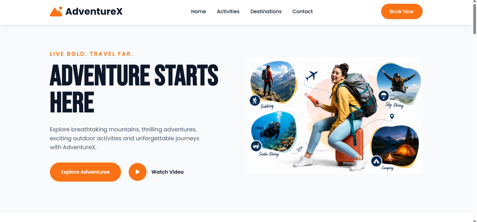
A well-designed landing page is an important part of creating a strong online presence. During my internship at Valentius Kryptix, I worked on an HTML/CSS Landing Page project where I designed and developed a responsive travel website called AdventureX. The main objective of this project was to create a modern, attractive, and user-friendly travel website that works smoothly across desktop, tablet, and mobile devices.
The website was designed to provide visitors with an engaging travel experience by presenting adventure activities, popular destinations, booking steps, customer testimonials, and a clear call-to-action. I focused on creating a clean and organized layout with consistent typography, colors, images, spacing, and responsive components. This project also gave me an opportunity to apply my knowledge of HTML5, CSS3, responsive web design, and JavaScript to a practical frontend development project.
Overview
The AdventureX landing page is designed for travelers who are interested in adventure activities and exciting destinations. The website provides visitors with an attractive and simple way to explore different adventure experiences and travel locations.
I developed the webpage by organizing the content into individual sections and using HTML to create the structure and CSS to control the visual appearance. I paid attention to spacing, alignment, typography, colors, image sizes, buttons, and card layouts to create a consistent user experience.
The website includes a hero section, adventure activities, popular destinations, a simple booking process, customer testimonials, a final call-to-action, and a footer. Each section was designed to provide useful information while maintaining a consistent visual style.
Technologies
The AdventureX landing page was developed using several frontend technologies. HTML5 was used to create the structure and content of the webpage. Different HTML elements were organized to create sections such as the navigation bar, hero section, activities, destinations, booking process, testimonials, call-to-action, and footer.
CSS3 was used to control the visual appearance of the website. I used CSS for colors, typography, spacing, buttons, cards, images, layouts, Flexbox, Grid, hover effects, and responsive behavior.
JavaScript was used to add interactive functionality, especially for the responsive mobile navigation menu. Web fonts and icons were also used where required to improve the visual presentation and usability of the website.
Combining HTML, CSS, and JavaScript helped me create a complete and interactive frontend landing page.
Key Features
Adventure Activities
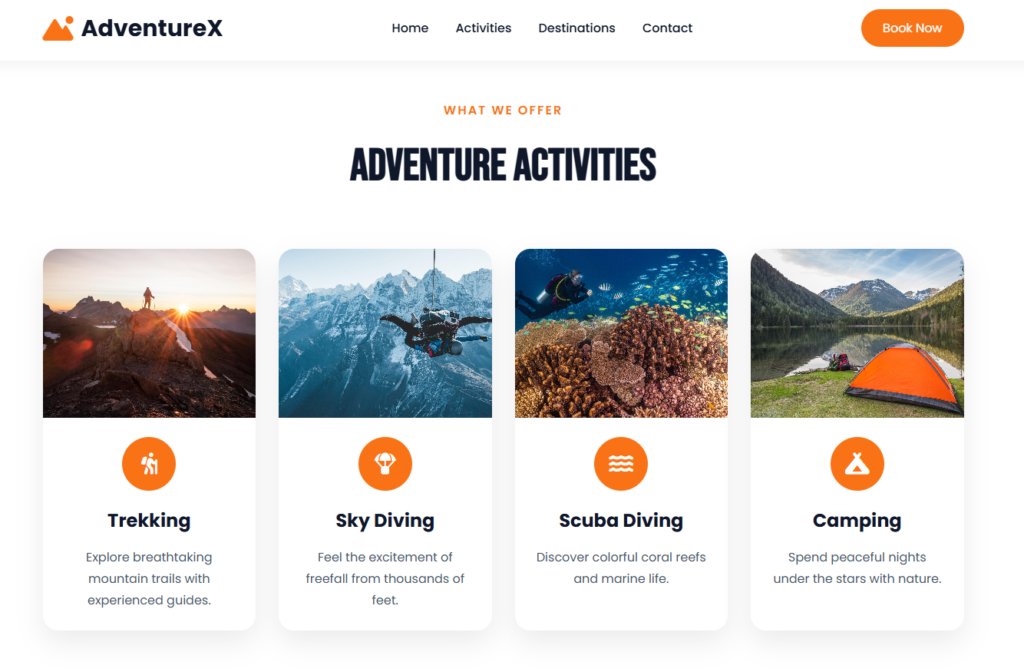
The Adventure Activities section highlights different experiences available to travelers. The website includes Trekking, Sky Diving, Scuba Diving, and Camping. Each activity is presented in a separate card with an image, icon, title, and description.
I used a card-based layout to make the information easy to understand and visually appealing. CSS Grid and responsive styling help the cards adjust according to the screen size. On larger screens, multiple cards can be displayed in a row, while on smaller devices the cards can adjust to fit the available space.
This section demonstrates how images, icons, text, spacing, and card layouts can be combined to create an engaging user interface.
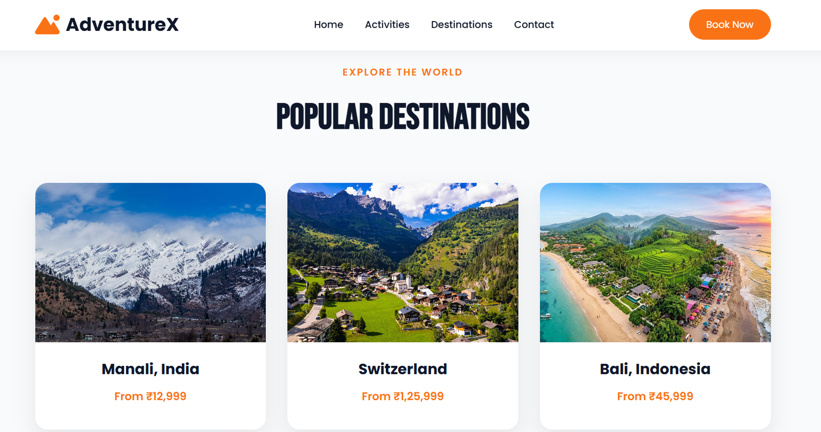
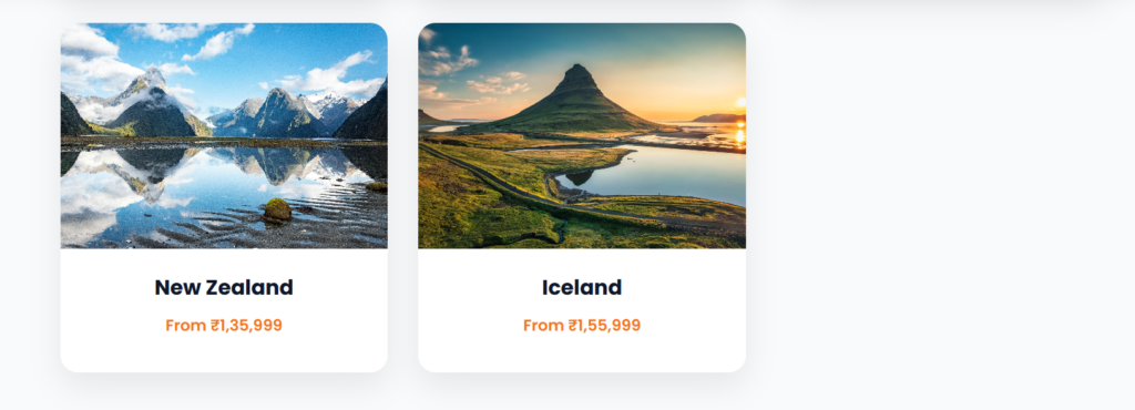
The Popular Destinations section provides visitors with different travel options. The AdventureX website showcases destinations including Manali, India, Switzerland, Bali, Indonesia, New Zealand, and Iceland.
Each destination uses an attractive travel image along with the destination name and pricing information. The use of travel images makes the section visually engaging and helps visitors quickly understand the available destinations.
I maintained consistent card sizes, spacing, image proportions, typography, and alignment to create a visually organized section. The responsive layout also allows the destination cards to adjust appropriately for tablets and mobile devices.
Booking Process
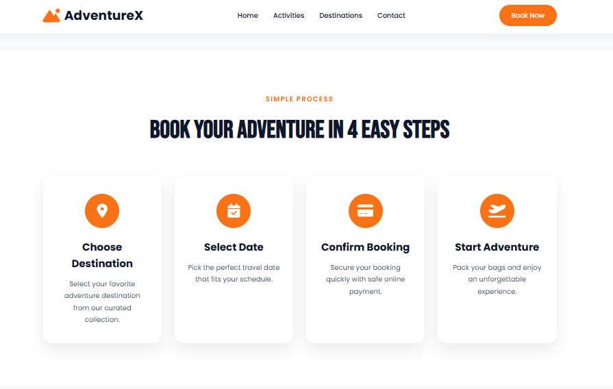
To make the travel process easier to understand, I created a simple four-step booking section. The process guides visitors through Choose Destination, Select Date, Confirm Booking, and Start Adventure.
Each step is displayed using a separate card with an icon and short description. This approach creates a clear visual flow and allows visitors to understand the process quickly.
The section also demonstrates the importance of visual hierarchy in frontend design. Icons, headings, spacing, and consistent card styling help guide the visitor through the booking process.
Customer Testimonials
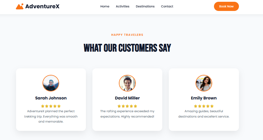
The testimonial section was included to make the landing page more engaging and provide social proof. It contains customer profiles, names, ratings, and reviews about their travel experiences.
I used individual cards to organize the testimonials and maintain consistency with the other sections of the website. Profile images and star ratings help make the section visually appealing and allow visitors to quickly understand the feedback.
This section also demonstrates how customer feedback can be presented in a clear and organized way on a landing page.
Responsive Design
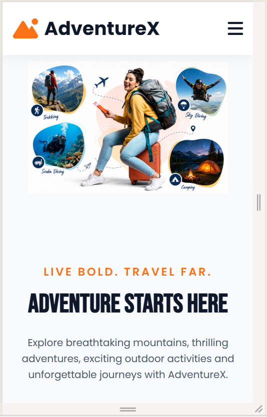
Responsive design was one of the most important parts of this project. A modern website should work properly on different devices, including desktops, tablets, and smartphones.
I used CSS media queries, Flexbox, CSS Grid, flexible widths, responsive images, and appropriate spacing to adjust the webpage according to different screen sizes. The navigation changes on smaller screens to provide a mobile-friendly menu, while cards and other content sections adjust their layout to fit smaller displays.
During development, I tested the website at different viewport sizes and corrected issues such as unwanted horizontal scrolling, incorrect spacing, oversized elements, and image positioning.
Testing the website on smaller screens helped me understand how desktop layouts need to be adapted for mobile users. The final responsive layout provides a better experience for visitors regardless of the device they use.
Challenges and What I Learned
While developing the HTML/CSS landing page, I faced several challenges, particularly in maintaining the same visual structure across different screen sizes. Achieving consistent spacing and alignment between sections also required careful CSS adjustments.
Another challenge was making sure that images maintained their correct proportions without affecting the surrounding content. I solved these issues by using responsive containers, Flexbox, CSS Grid, media queries, and repeated testing.
The mobile navigation was another important part of the project. JavaScript was used to control the mobile menu so that users could easily access the navigation links on smaller screens.
This project helped me improve my understanding of HTML5, CSS3, JavaScript, responsive web design, Flexbox, Grid, typography, image handling, and frontend debugging. I also learned how important small details such as spacing, alignment, font sizes, and image proportions are when creating a professional webpage.
Most importantly, I learned how to convert a visual design concept into a functional and responsive website.
Final Call-to-Action and Footer
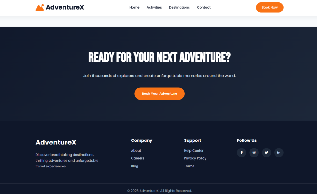
The final section of the AdventureX website encourages visitors to start planning their next adventure. A clear call-to-action and booking button are used to guide visitors toward taking action.
The footer provides additional navigation and information, including the AdventureX brand, useful links, support information, and social media icons. Together, these elements provide a complete ending to the landing page.
The final section also maintains the visual style of the rest of the website while providing visitors with useful navigation options.
Conclusion
The AdventureX HTML/CSS Landing Page was a valuable practical project during my internship at Valentius Kryptix. It gave me an opportunity to apply frontend development concepts to a practical project and strengthen my understanding of HTML, CSS, JavaScript, and responsive web design.
By developing the hero section, adventure activities, destinations, booking process, testimonials, call-to-action, and footer, I gained practical experience in creating a complete and visually consistent landing page.
The project also improved my problem-solving and debugging skills and helped me understand the importance of responsive design and user-friendly layouts. Overall, this experience increased my confidence in frontend development and encouraged me to continue learning and building modern, responsive websites.

Leave a Reply
You must be logged in to post a comment.